A Designer Walks into a Welfare Office
What the system communicates before it serves
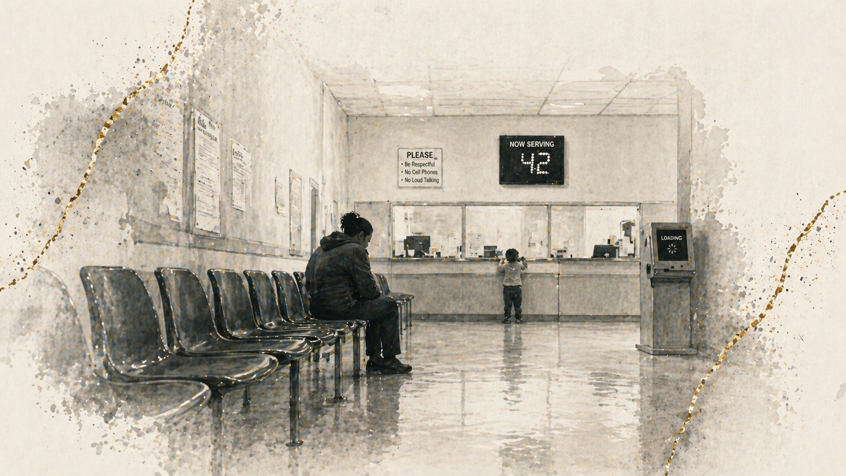
“You’re number 42. Take a seat.”
The system hadn’t even met me, and I already felt reduced.
Entry
The moment I stepped through the sliding doors, I stopped being who I was.
Not a designer. Not a father. Not someone with context.
Just a number.
A case.
A person expected to wait.
Rows of metal chairs lined the room. A toddler cried in the corner while someone tried to complete a form with the only working pen, taped to a clipboard. A woman kept checking the screen, even though the numbers hadn’t moved in ten minutes.
This was not an office.
It was a place designed to hold people.
Once you experience it from the inside, you don’t design the same way again.
The Architecture of Humiliation
The space communicated clearly, even without saying much:
Your time does not matter.
Your situation is not unique.
Keep it brief.
The signage emphasized compliance. Respect for staff was printed in bold red text. There was no equivalent message about respect for the people waiting.
The environment was dated. Posters peeling. Lighting harsh. The restroom locked behind a key.
There were no clear cues for where to begin or who to ask. Just a ticket printer and a kiosk that spent more time loading than working.
It felt less like a service environment and more like a system that expected you to fail quietly.
What the System Gets Wrong
From a design perspective, the breakdown is obvious.
No onboarding
There is no clear starting point. No explanation of process. No orientation for first-time users.
No accessibility prioritization
Language options are limited or nonexistent. Assistance is not proactive. Those who struggle are left to self-correct in public.
No trauma awareness
The environment amplifies stress. Noise, lighting, and uncertainty compound what people are already carrying.
This is often framed as a resource issue.
It isn’t.
It is a prioritization issue.
What I Would Fix
None of this requires invention.
It requires intention.
Clear navigation
Defined zones for intake, assistance, and processing. Visible “Start Here” and “Need Help” markers.
Mobile-first check-in
A simple system to register, receive updates, and reduce uncertainty about wait times.
Human guides at entry
People trained through lived experience, positioned to help, not gatekeep.
Language access by default
Forms, interfaces, and support available in multiple languages without request.
Trauma-informed environments
Lighting, seating, and layout designed to reduce stress, not amplify it.
These are not premium features.
They are baseline dignity.
Exit
When I left, I didn’t feel relief.
I felt clarity.
Public systems are not neutral. They shape behavior, perception, and outcome.
When we treat their design as an afterthought, we don’t just slow people down.
We diminish them.
Design is not only about making systems function.
It is about making people feel like they matter.
I walked in as a designer.
I walked out as a witness.

Subscribe to Amid the Noise
Amid the Noise is an ongoing body of work on signal, systems, governance, AI, and the structures that shape human judgment under pressure.
Subscribe to receive new essays as they are published.